Responsive Design Revolution: Unleashing the Power of Container Queries
Deep Dive into CSS Container Queries: Best Practices and Examples


When creating responsive web applications, media queries have, over the years, taken the front seat, playing a crucial role in ensuring web applications fit into different screen sizes. This improves how users interact with the application and enhances its overall appearance.
On this note come container queries. Besides being able to style and move elements around the page based on the viewport (width and height), you can now change things on the page based on an object containment area.
Imagine being able to style and move things around based on a container’s width and not just the viewport. Interesting right? Well, this is a reality with container queries. In this article, we will look at what container queries are, how to use them, and the various values they take.
Prerequisite:
Understand the role of media queries in responsive design.
Ability to create media queries to apply different styles based on screen characteristics such as width, height, and device orientation.
Understand how to use the developer tools
What are container queries?
Unlike media queries, container queries help to style HTML elements based on the width or height of their container. This means you can change an element’s font size, color, display, or even hide said element when a certain width or height is attained on the container. The space within the container is called a containment context. More on containment context shortly.
How to use container queries.
To create a container query, we first need to create a containment context. A containment context is a space (area) you explicitly point out to the browser that you intend to use later. This space can be a div wrapping a group of elements, or any element encapsulating other elements.
Consider the code below:
<!-- a containment context -->
   <div class='container'>
      <section class='section1'>
         <div class='image-div'></div>
         <p class='lorem-writing'>
            Lorem ipsum dolor sit, amet consectetur adipisicing elit. Alias harum fugit minima nihil. Exercitationem quidem adipisci vel earum, blanditiis dolor?
         </p>
      </section>

      <section class='section2'>
         <div class='image-div'></div>
         <p class='lorem-writing'>
            Lorem ipsum dolor sit, amet consectetur adipisicing elit. Alias harum fugit minima nihil. Exercitationem quidem adipisci vel earum, blanditiis dolor?
         </p>
      </section>
   </div>
   <!-- /a containment context -->
Placing the two section elements inside the parent div has created a containment context. We can now use the CSS container query to style the elements within the container. This is done using the CSScontainer-type property.
Container type property
The container-type property is where you decide whether you want to query an element based on its parent width or height measurements. To use it, we select the element having a containment context, either with an id or class selector, and apply the container-type property to it. Like so:
.container {
    container-type:  ;
}
As with CSS properties, the container-type property accepts various values. It takes one of three values:
SizeInline-sizeNormal
Value Effects
Size:
When we use container-type:size on a container, we are simply telling the browser to style the content of that container based on its width and height measurements. Using this value may lead to lots of overflowing content issues in your document. However, there is a better option.
Inline-size:
Inline-size is a commonly used value and is the one you want to use. Inline-size queries a container based on its horizontal measurement (that is, left to right or right to left, depending on the language). Consequently, when we use container-type:inline-size, styles are applied to the content of that container based on its width measurement only.
Normal:
Whenever container-type is set to normal on a container, styles cannot be applied to that container based on its size measurement. However, it remains a container query. Think of normal as a neutral value.
Now that we know how the various values work, let’s get practical using the inline-size value.
.container {
  container-type: inline-size; /* container query */
}
We just made the container class above a container query; hence, we can now query it based on its width, but we still need to define what styles to apply and what conditions to apply them. To do this, we need to use the @container rule.
@ container rule
Above, we have a container ready to be styled, but we haven’t specified what styles to apply to the container. That is when @container rule comes in. The @container rule works the same way media queries work with the @media rule. The syntax is as follows:
@container (condition) {
    /* .... content */
}
At this point, I would suggest you open your preferred code editor, copy and paste the HTML code above into your HTML body and the code below into your CSS file, and link your CSS file to your HTML head tag so that we can both have a uniform look.
body {
    background-color: #333;
}

.image-div {
    width: 100px;
    height: 100px;
    border-radius: 10px;
    background-image: linear-gradient(red, purple);
}

.container {
    color: #fff;
    display: flex;
    flex-direction: row;
    justify-content: center;
    align-items: center;
    column-gap: 1rem;
    padding: 1rem;
    container-type: inline-size; /* container query */
}

.section1,
.section2 {
    background-color: aqua;
    color: #000;
    border-radius: 10px;
    padding: 1rem;
    column-gap: 10px;
    display: flex;
    flex-direction: center;
    align-items: center;
    justify-content: center;
}

.section1 div,
.section2 div {
    border: 2px solid #000;
    padding: 1rem;
    margin-top: 10px;
}
If you did that correctly, you should have a look like the one below 👇:
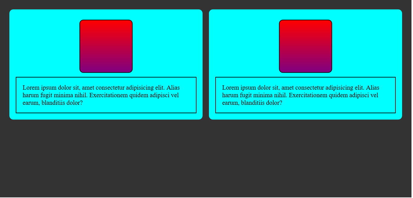
Using container query, we will target the paragraph elements and change their text color to red, transform, and apply a skew effect to the div boxes, and align the boxes to the left when the container gets to a width of 600 pixels.
Let's begin by setting the container rule to kick in at 600px.
@container (max-width: 600px) {
    .lorem-writing {
        color: red;
    }
}
After setting the container rule, we selected the two paragraphs on the page with the class name of .lorem-writing, and changed their text color to red.
Next, we will select the boxes with the class name of .image-div and apply a skew effect of 10 degrees to them using the transform property.
@container (max-width: 600px) {
    .image-div {
        transform: skew(10deg);
    }
}
Now, let's align the boxes to the left.
@container (max-width: 600px) {
    .image-div {
        align-self: start;
    }
}
So, when we combine the codes, we now have this:
@container (max-width: 600px) {
    .lorem-writing {
        color: red;
    }

    .image-div {
        transform: skew(10deg);
    }

    .image-div {
        transform: skew(10deg);
    }
}
The sandbox below shows a practical example of the output of our example. You can also open your developer tools to test the result.
So far we look good. However, we can add some level of precision to our code by giving the containers a unique name using the container-name property.
Naming containment areas
With container-name, we can give containment areas unique names to target elements within that area. This comes in handy when you have more than one container on the page that you intend to apply specific changes to individually.
To implement this, we just add the container-name property to the container class and give it the value of the name we want to use. In this example, “box” is our unique container name.
.container {
    color: #fff;
    display: flex;
    flex-direction: row;
    justify-content: center;
    align-items: center;
    column-gap: 1rem;
    padding: 1rem;
    container-type: inline-size; /* container query */
    container-name: box; /* container name */
}
It's not mandatory to use the container-name property. However, using the container-name property will help us pinpoint what container is being styled and what rules are being applied easily.
There is a shorthand syntax for both the container-type and the container-name property. It goes like this: container: container-name / container-type. See the example below:
.container {
    /* container-type: inline-size; container type */
    /* container-name: boxes; container name  */
    container: boxes / inline-size; /* shorthand syntax */
}
Note that when using the shorthand syntax, the container-name must always come before the container-type.
Using conditionals in container queries
Speaking of syntax, there is so much more we can do when using container queries. Like media queries, we can use conditionals like (≤, ≥) in our @container rule. For example:
@container boxes (width <= 600px) { /* using conditionals */

}
Container query length units
In addition to the flexibility of using container queries, when applying styles to a container, you can also use container query length units. These units take effect relative to the percentage size of the container. And like container-type values (inline-size), they also enable us to style elements based on either the width or height of that element.
They are as follows:
cqwcqhcqicqbcqmincqmax
Unit Effect
cqw, which reads “container query width”, styles an element based on the percentage (%) size of the container width. Meaning, if the container’s width is 500px, then 50cqw will be 250px.cqh, “container query height” as you might have guessed, styles an element based on the percentage size of the container’s height. Consequently, if a container's height is 1000px, then 50cqh will be 100px.cqi, which reads “container query inline-size”, styles an element based on the percentage size of the containerinline-size(horizontal measurement). Again,inline-sizeis the value you want to use.cqb, which reads “container query block”, using this value will style an element based on the percentage size of the container block measurement. So, 10cqb on a 400px block size will be 40px.cqmin, which reads “query container min”, applies styles to an element based on its container's percentage size of the minimum value between the container'sinline-sizeand block size measurements.For example, if a container’s
inline-sizeis 800px and its block size is 300px, then 50 cqmin on that container will be 150px. This is because it picks the minimum value from the measurement.cqmax: you guessed right, “container query max”. Unlike cqmin, cqmax applies styles based on the percentage size of a container’s maximum value between the container'sinline-sizeand block size measurements.For example, if a container’s
inline-sizeis 800px and the block size is 300px, then a 50cqmaxquery on that container will be 400px.
We now know how the units work. Let’s take a look at the use case below:
Unit use case
This example uses container query inline-size (cqi) to change an element font size based on its container inline-size.
@container boxes (width <= 600px) {
    .lorem-writing{
        color: red;
        font-size: 1cqi;
    }
}
Above, we used a container query unit size of 1cqi which is equivalent to 1 percent (%) of the container's width. Now, the font size will adjust following the container's width.
Conclusion
It’s worth mentioning that container queries are not meant to replace media queries. However, when used with media queries, container queries give us more control over responsive states in web apps. Furthermore, container queries are well-supported by most modern browsers, making them a safe choice. As regards container-type values, inline-size is the most suitable choice unless you have a good use case for size. Have fun playing around with them. Thanks for reading. Catch you on the next one.